Case study · MICRO
MICRO: Rebranding a Metal Stamper for the Medical Market
Since 2009
an ongoing HAP partnership
In-house
strategy, design, video & production
Full rebrand
identity through advertising
The challenge
MICRO had spent decades building a reputation as a traditional metal stamper. But the company's capabilities had evolved far beyond its brand — it was expanding into the medical industry and needed to be seen as what it had become: a cutting-edge, precision-driven manufacturer held to the standards medical applications demand.
What we did
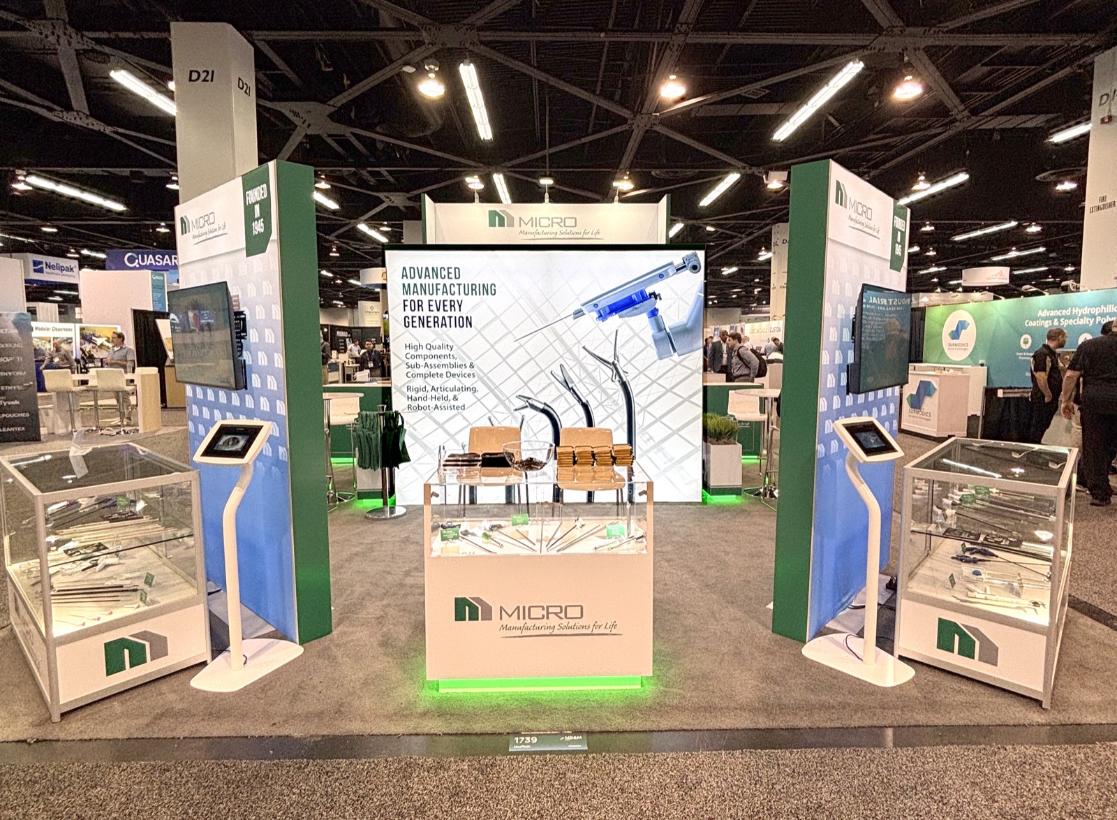
We led a complete brand transformation, starting with the visual identity. MICRO's legacy logo — built around a micrometer — was reimagined into a modern, forward-looking mark aligned with the company's advanced capabilities and target market.
From there we built the new brand out across every touchpoint: a high-quality video featuring interviews with executive leadership and showcasing capabilities from cleanroom environments to advanced equipment and tubing expertise, plus redesigned brochures, advertisements, and imagery that reinforce the new positioning.
Every piece was executed in-house — which kept the creative aligned, the collaboration seamless, and the delivery efficient.
The results
The rebrand repositioned MICRO as a trusted, high-precision partner for the medical industry. The updated identity and messaging now match the sophistication of the company's capabilities — and they're helping MICRO attract new opportunities and strengthen its market presence.
The partnership has continued since 2009, with ongoing support across a wide range of initiatives. Today MICRO is highly regarded in the medical space, with a brand that stands for innovation, quality, and precision — exactly where they set out to be.

This is what our Creative Design & Marketing team does every week. See the full capability, or tell us about your program.